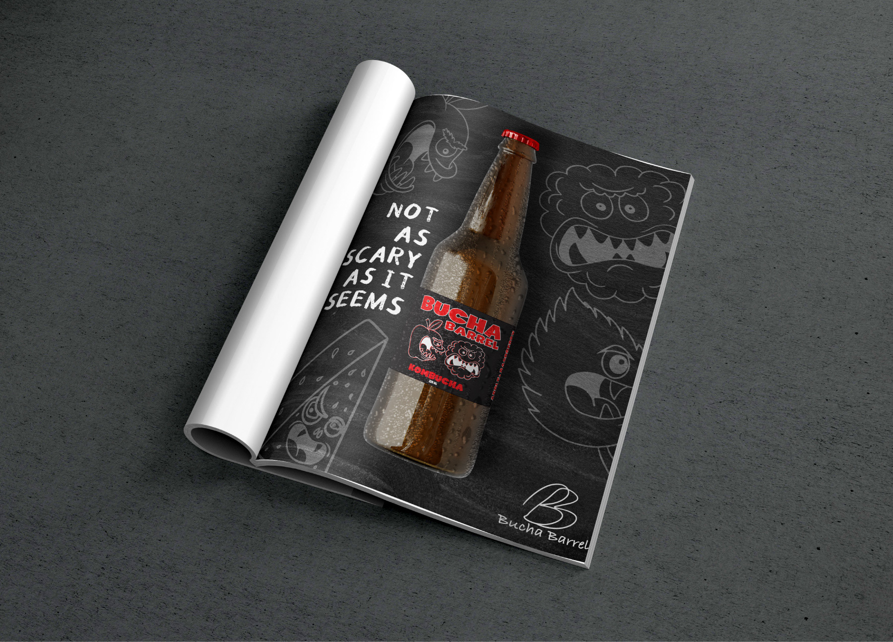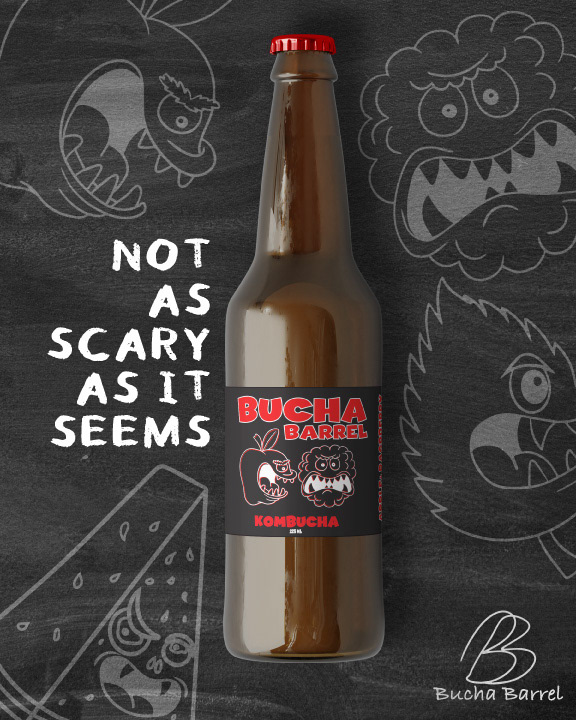
The objective of the project was to create a new line of kombucha labels for a local kombucha company. We then were tasked to create an ad campaign for the kombucha by creating a magazine ad, a Facebook ad and an Instagram ad.
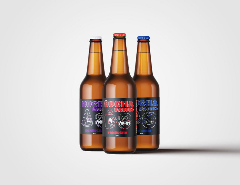
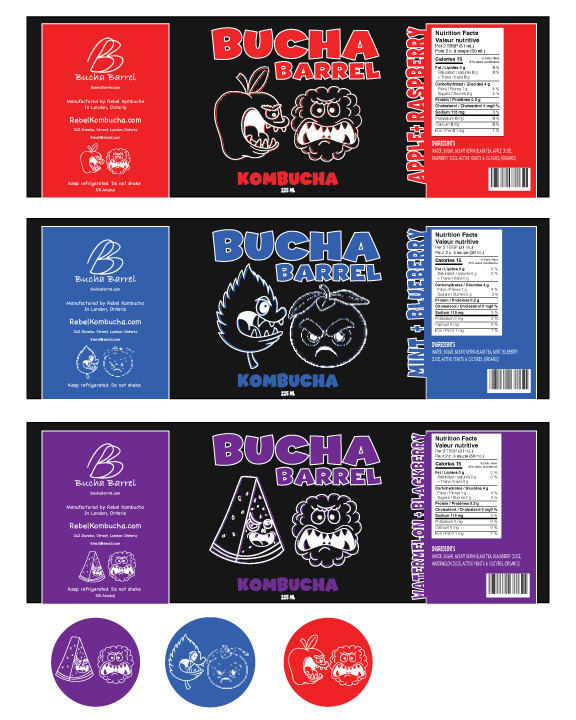
For this project, I began with the brand name Bucha Barrel and developed a campaign around it. The central idea was to challenge the common misconception that kombucha can be intimidating, aiming to show that it’s not as scary as it seems once you give it a try. To convey this, I created playful, exaggerated representations of the fruits used in the various kombucha flavours, turning them into “scary” versions to add a humorous touch.
I also focused on keeping the colour scheme simple and cohesive, using a single colour to represent each flavour. This approach ensures that even without labels or text, the colour alone provides a strong visual cue for the flavour, making it easy for customers to identify the product on shelves.
To complement this, I designed an ad campaign centred around the tagline “Not as scary as it seems,” which plays on the common fear of kombucha while injecting humour into the message, helping to make the product feel more approachable.