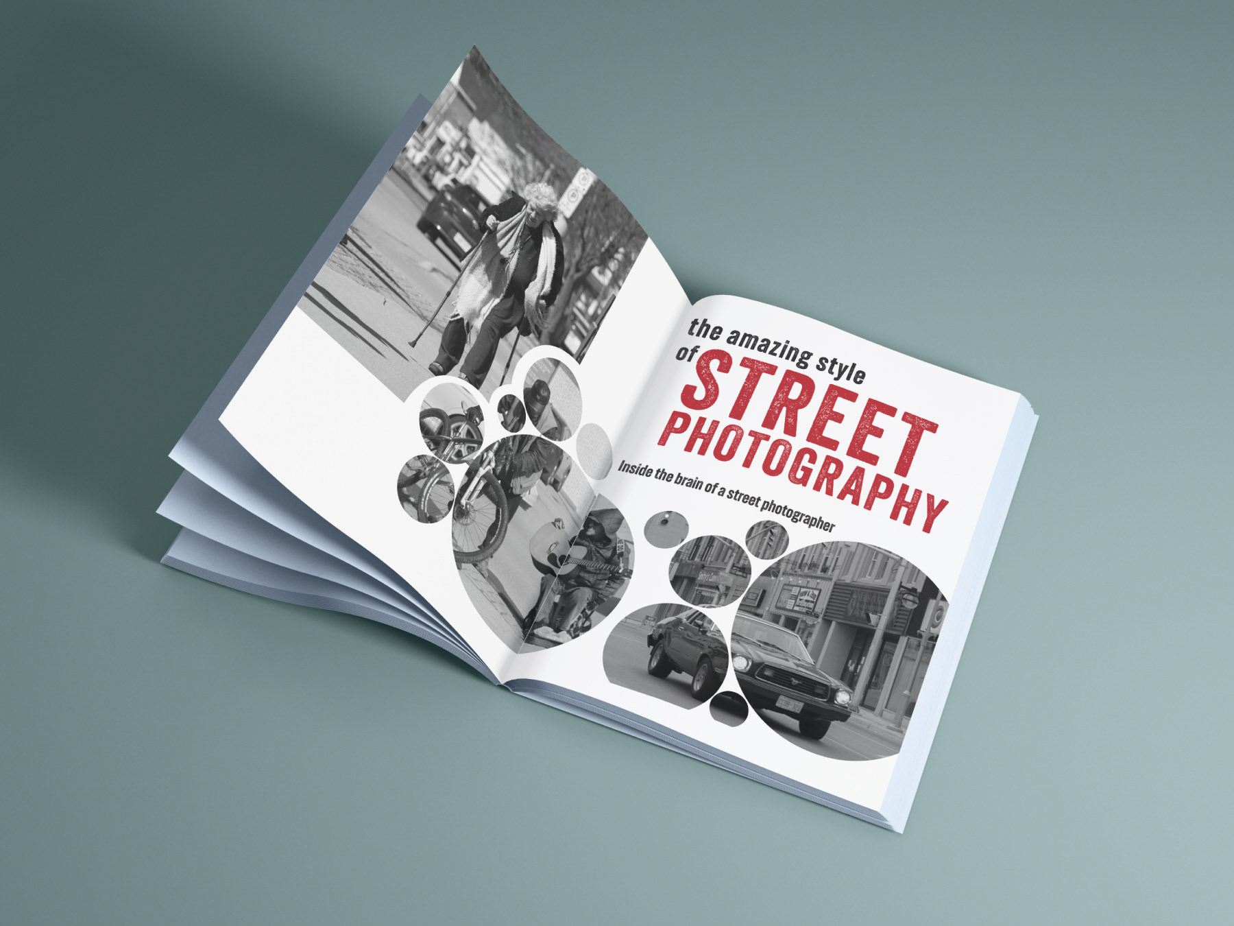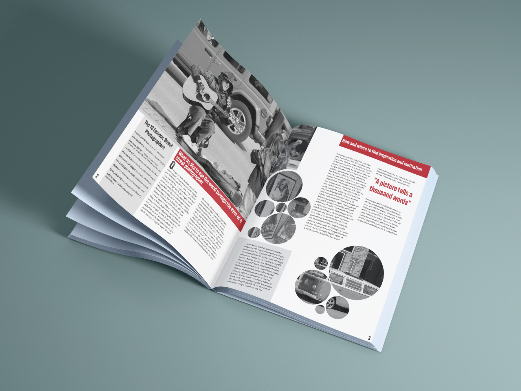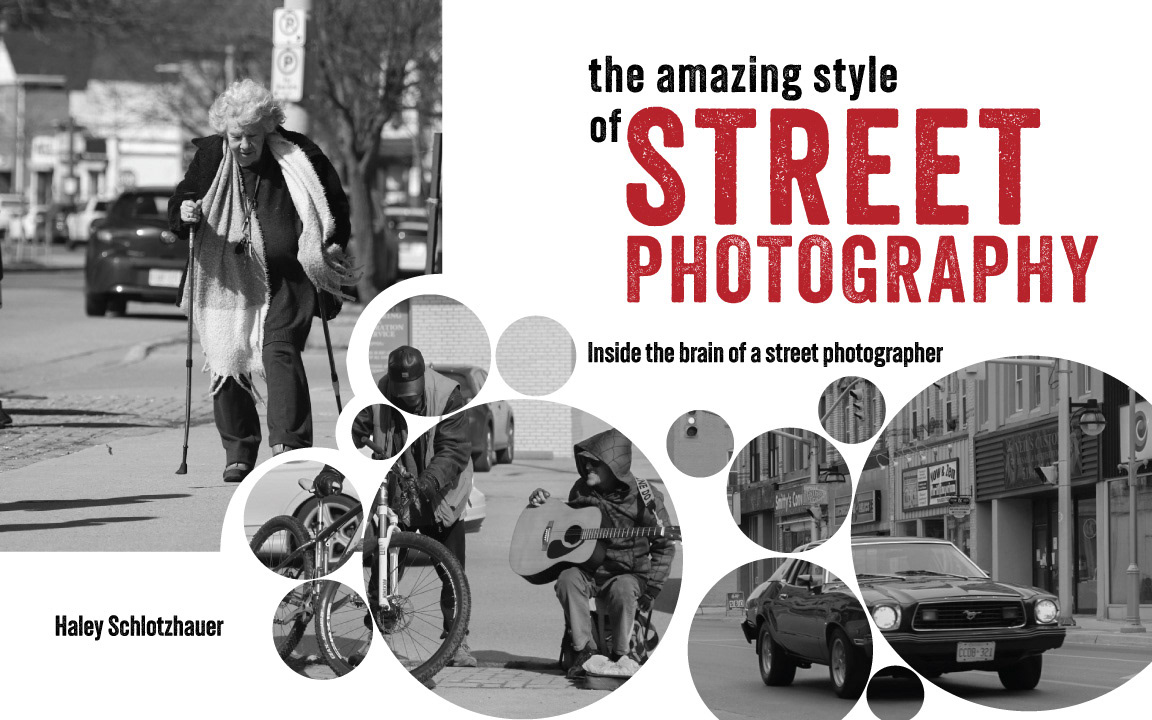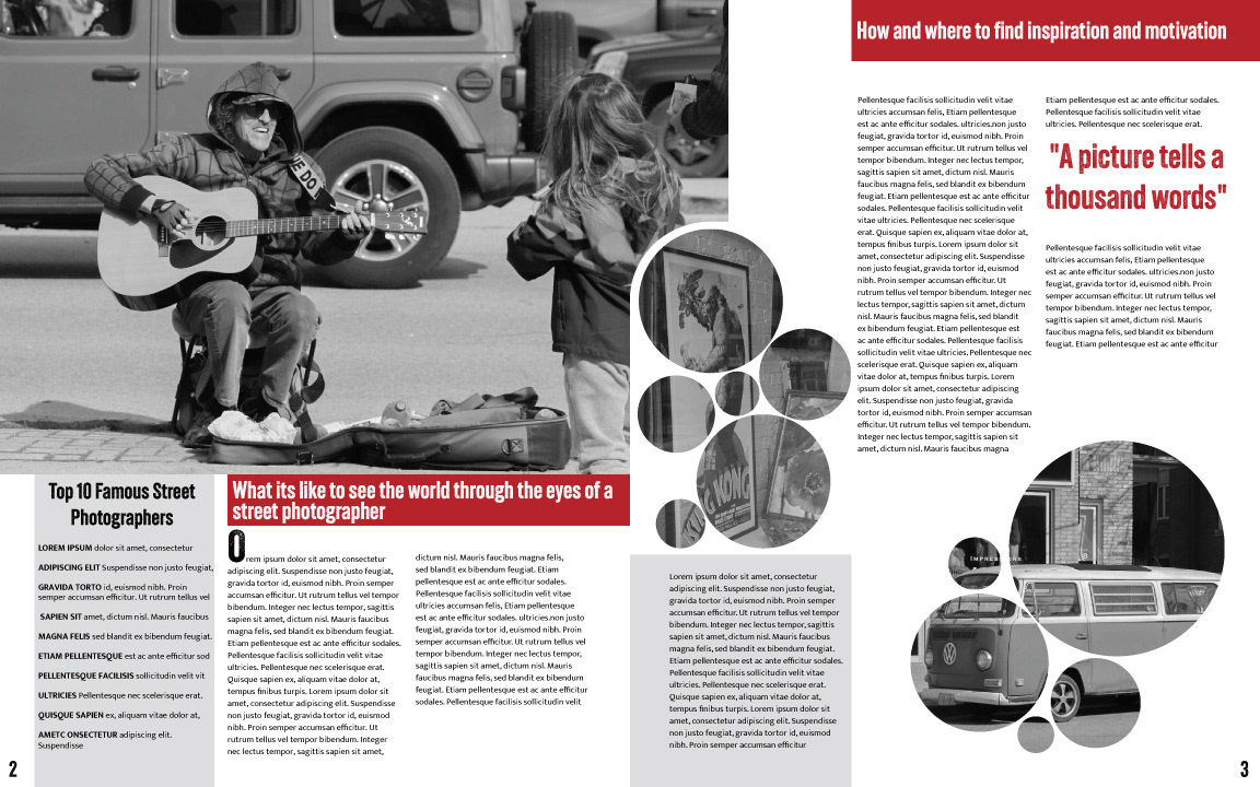
We were tasked to create a two-page magazine spread on a topic of our choosing, using photography that we had taken.
For this project, I wanted to create a magazine spread that highlights my passion for street photography. Having already captured a diverse range of images, I carefully selected a series of photographs to feature. To maintain a cohesive and striking aesthetic, I chose to keep all the images in black and white. This decision allows the use of a single accent colour, red, to stand out, adding vibrancy and focus to the design while maintaining a clean and minimalistic look across the two spreads.